Nation
Brand Identity & Landing Page Concept for an AI Store Builder
Two brand identities and two working hero prototypes for an AI startup that wants to feel like “a nation, not a SaaS”. Concept work made in response to an open brief.
- Brief
- Nation (withnation.ai), open brief on Contra
- Type
- Concept work, not a commissioned project
- My role
- Brand, UI design and front-end build
- Made
- 2 logos · 2 hero screens · 2 prototypes
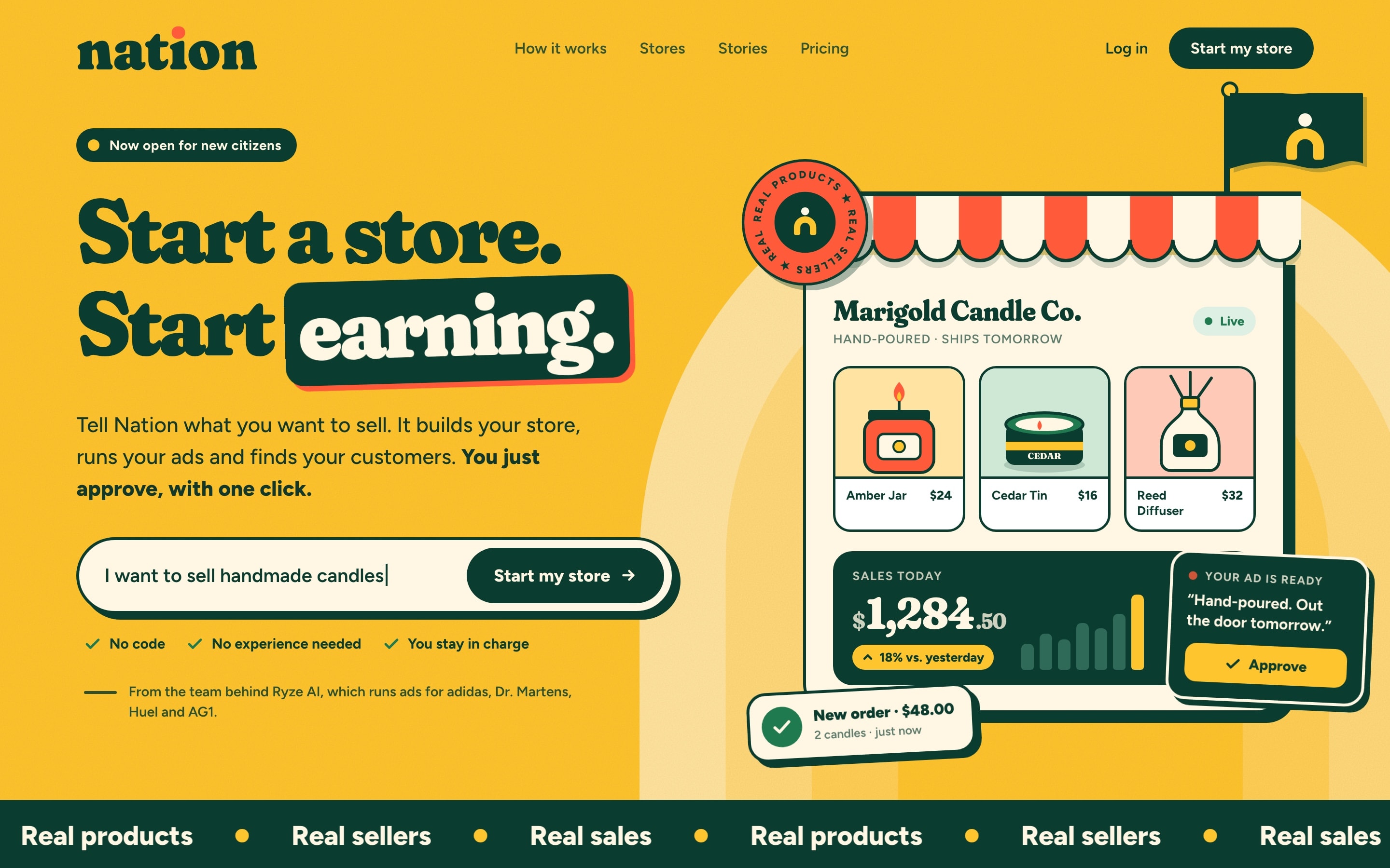
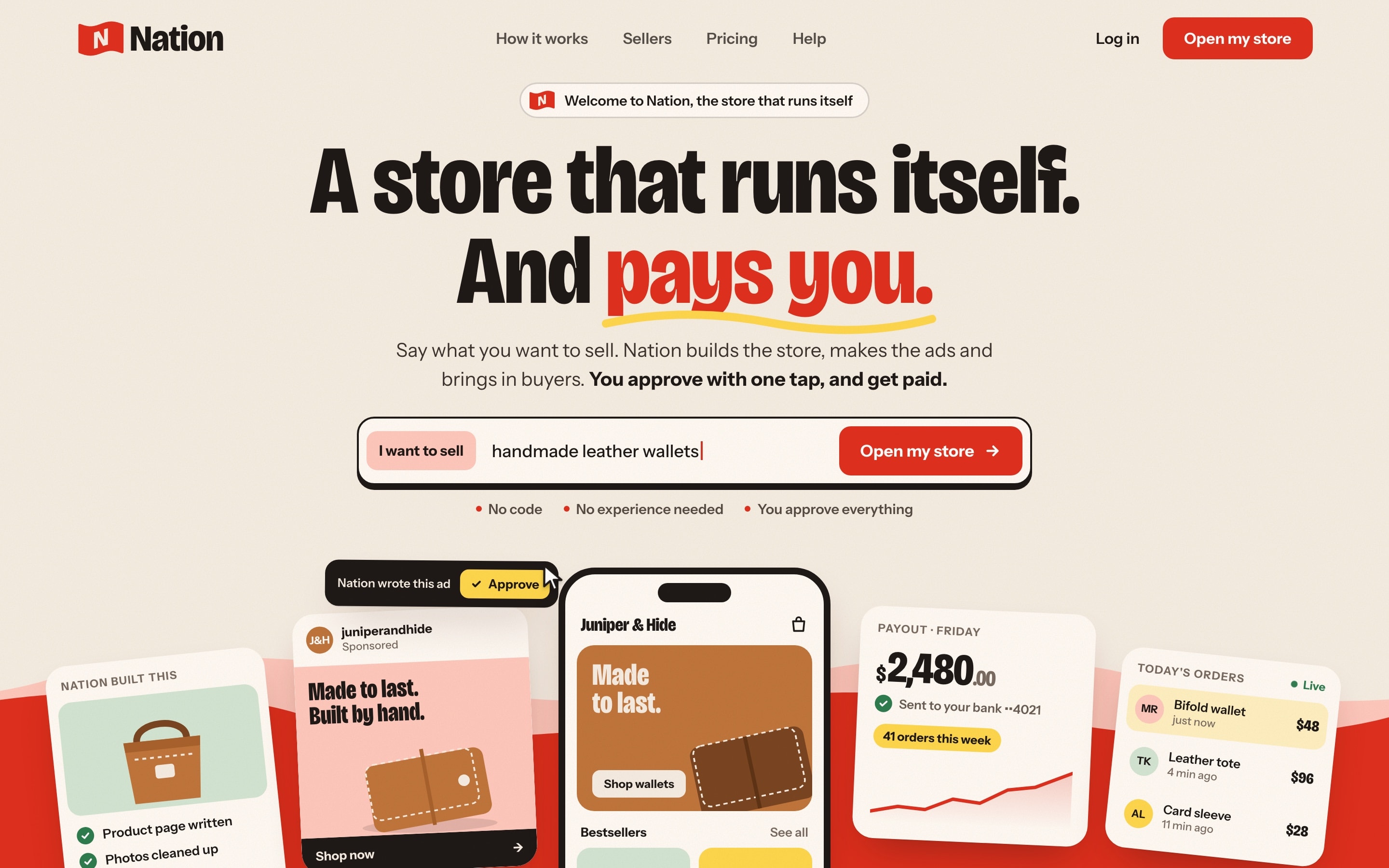
I answered the open brief with two deliberately different identities, each with a logo system, a palette, type and a first landing-page hero, built as working HTML and CSS prototypes.
Below: the brief, how I approached it, both directions in detail, a side-by-side comparison and what I’d do next.
A Shopify competitor that has to feel like home.
Nation is a store that runs and markets itself. A person types one prompt. The AI handles products, pages, ads and growth, and the owner approves with one click. The customers are people who want to earn their own money, many starting a business for the first time.
- 1Positioning & messaging
- 2Brand identity: logo, type, colour, visual language
- 3A design system the team can build on
- 4The first landing page
“A nation, not a SaaS.”
Warm, but credible
It has to welcome first-time owners and still read as a serious, established company on the first screen.
Complex, made simple
The AI does a lot. The page has to show it without jargon and lead straight to starting a store.
Bold from day one
No existing brand to lean on. The identity has to be memorable immediately, in a crowded market of SaaS blue.
Two directions, so the choice becomes clear.
Citizen
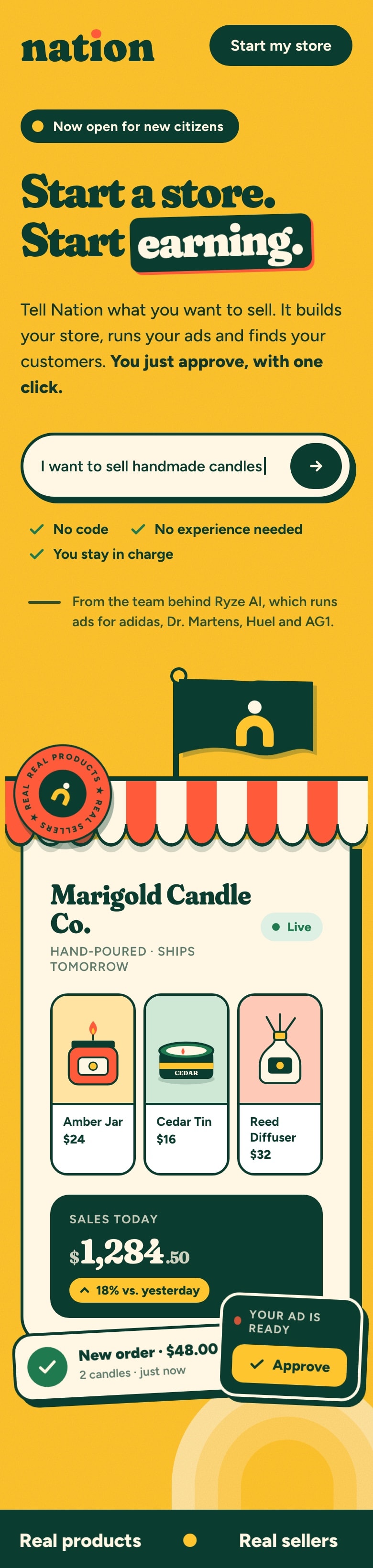
Nation as a warm place you belong to. Sellers are citizens. Gold, a soft heavy serif, awnings and passport stamps.
Raise your flag
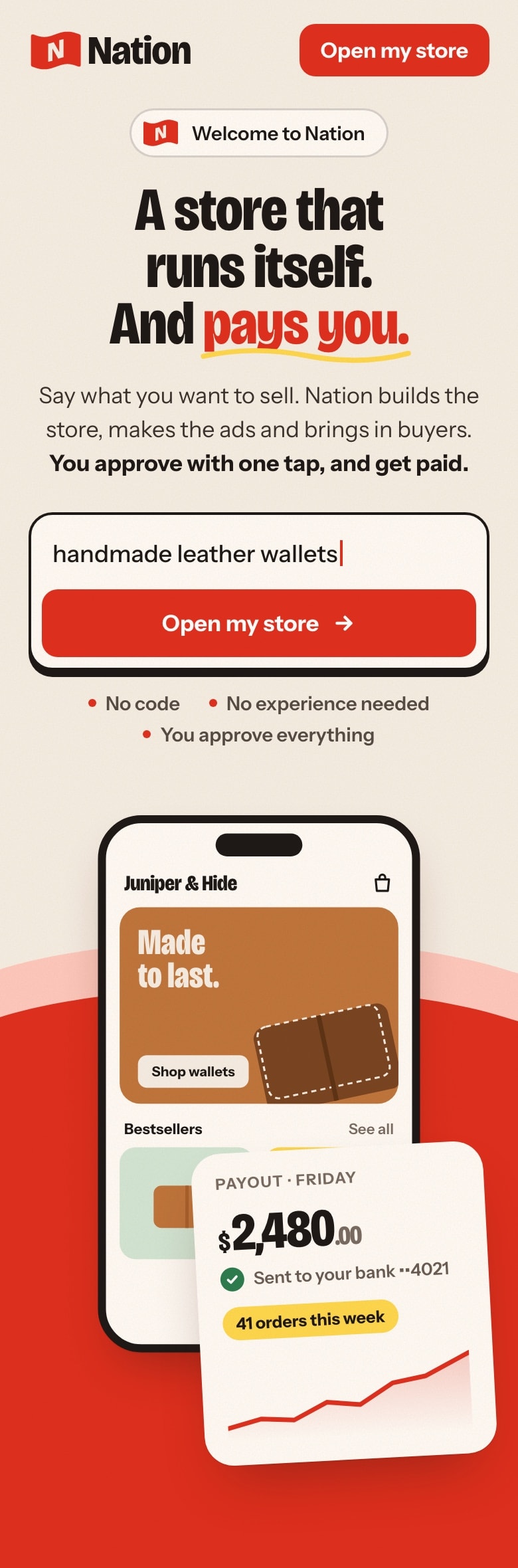
Nation as the flag every seller raises, with the whole product on show. Flag red, a loud condensed grotesk, real product cards.
- 1
Read the brief
Pulled out the feeling, the audience and the three hard problems.
- 2
Set principles
Four rules every decision had to pass.
- 3
Explore two poles
One warm and human, one bold and legible, to see which fits.
- 4
Design logo & hero
A mark, palette, type and the first screen for each.
- 5
Prototype in code
Built both heroes to test layout, motion and mobile.
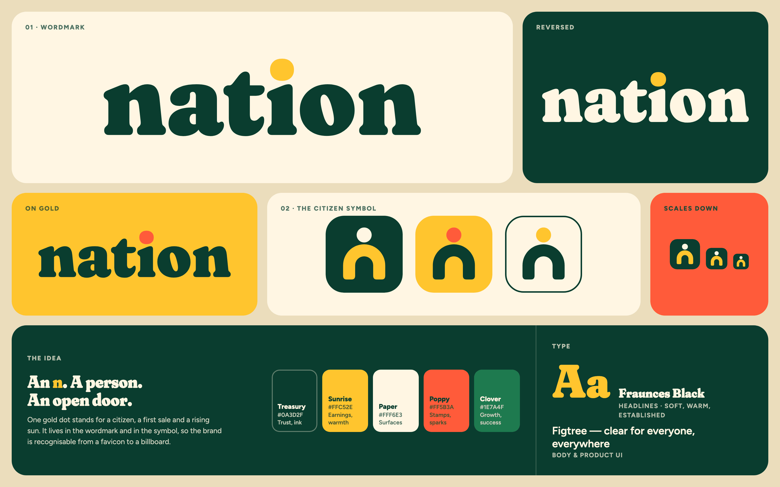
Citizen
A warm place you belong to, where every seller is a citizen and every first sale is a sunrise.
- 1
One gold dot
The dot over the “i” is the signature: a citizen, a first sale, a sunrise.
- 2
A symbol with three readings
A dot over an arch reads as an “n”, a person and an open shop door.
- 3
Heritage, softened
Fraunces Black with its softness turned up feels established and friendly at once.
Direction 01 · The hero
“Start a store. Start earning.”
The money promise in five words, with the key word on a green tag.
The product is the button
A prompt bar that types out example stores, so starting feels like one sentence.
A place, not a dashboard
Awning, flag and passport stamp turn the product shot into a shop you’d want to own.
Trust on screen one
The founders’ track record sits right under the call to action.
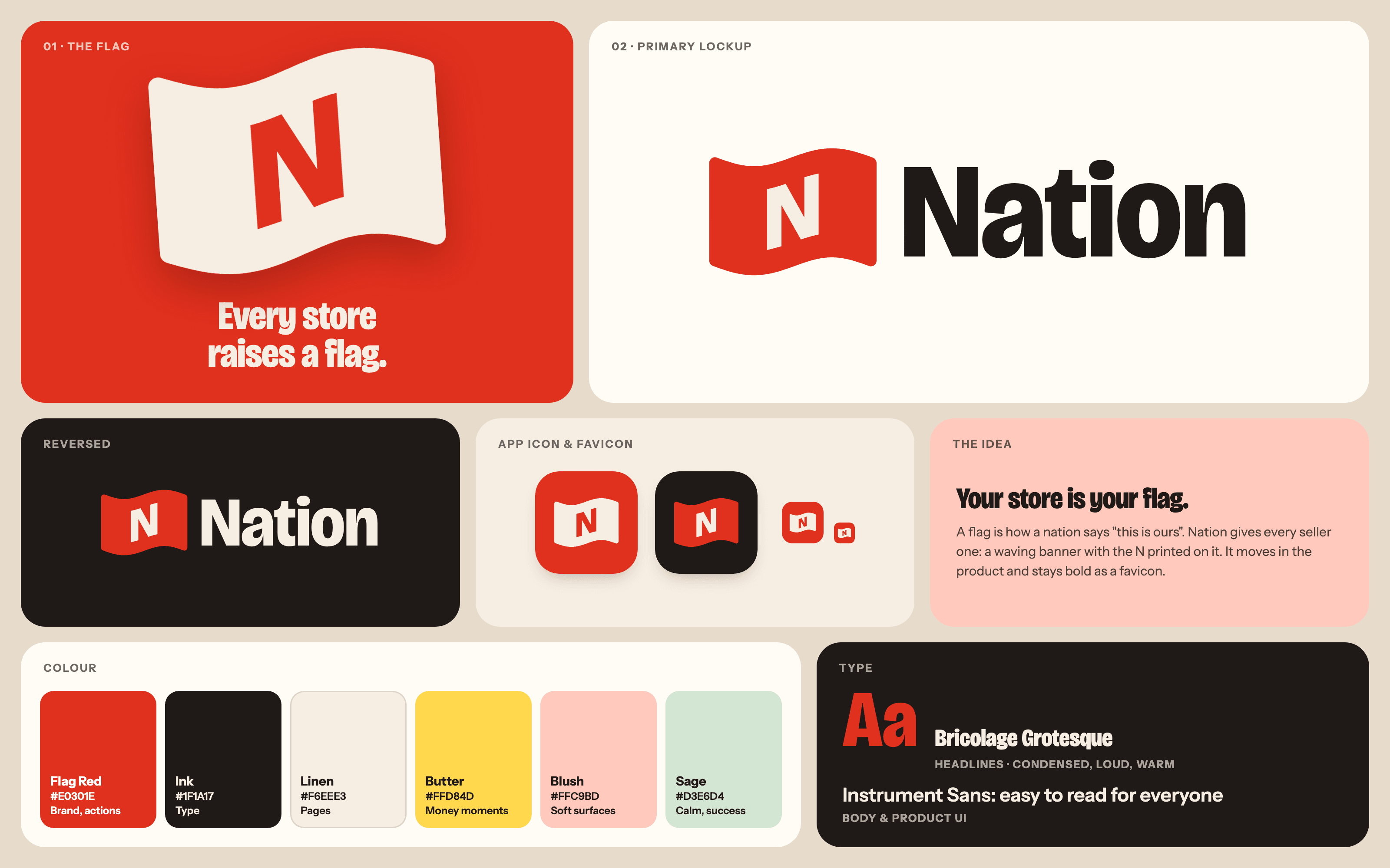
Raise your flag
Your store is your flag. A symbol of ownership, in one confident red.
- 1
A flag with the N printed on it
The letter follows the wave, so it reads as cloth, not as an icon.
- 2
One loud red, everything else warm
Linen, blush and sage keep the red friendly. Butter is reserved for money.
- 3
A voice with weight
Condensed Bricolage Grotesque fits big promises in few words and still feels human.
Direction 02 · The hero
“A store that runs itself. And pays you.”
Positioning and payoff in one breath, with “pays you” in red.
The whole product at once
Product page, ad, live store, payout and orders rise out of the flag. Inspired by the brief’s Toast reference.
The AI works, you approve
A written ad with a one-tap Approve shows the relationship without jargon.
The money, on screen one
A Friday payout and live orders make “pays you” concrete.
Same brief, two different answers.
| 01 · Citizen | 02 · Raise your flag | |
|---|---|---|
| Feeling | Warm, friendly, a little heritage | Bold, direct, poster-like |
| Logo idea | A gold dot over an “i”, and over an arch: citizen, sale, sunrise, door | A waving flag with the N printed on the cloth |
| Colour | Gold, deep green, cream, poppy | Flag red, ink, linen, butter |
| Type | Fraunces Black (soft serif) + Figtree | Bricolage Grotesque condensed + Instrument Sans |
| Hero structure | Headline left, one detailed storefront right | Centred headline, whole product shown below |
| Strongest at | An ownable, warm brand that feels like “a nation, not a SaaS” | Showing the product and the money clearly in five seconds |
| Trade-off | Shows one store, not the full product | The flag is the more expected idea, and the cards lean closer to a SaaS look |
- Feeling
- 01 · CitizenWarm, friendly, a little heritage02 · Raise your flagBold, direct, poster-like
- Logo idea
- 01 · CitizenA gold dot over an “i”, and over an arch: citizen, sale, sunrise, door02 · Raise your flagA waving flag with the N printed on the cloth
- Colour
- 01 · CitizenGold, deep green, cream, poppy02 · Raise your flagFlag red, ink, linen, butter
- Type
- 01 · CitizenFraunces Black (soft serif) + Figtree02 · Raise your flagBricolage Grotesque condensed + Instrument Sans
- Hero structure
- 01 · CitizenHeadline left, one detailed storefront right02 · Raise your flagCentred headline, whole product shown below
- Strongest at
- 01 · CitizenAn ownable, warm brand that feels like “a nation, not a SaaS”02 · Raise your flagShowing the product and the money clearly in five seconds
- Trade-off
- 01 · CitizenShows one store, not the full product02 · Raise your flagThe flag is the more expected idea, and the cards lean closer to a SaaS look
Where I’d startLead with Citizen for the brand, and borrow Raise your flag’s “whole product at once” layout for the homepage.
Built in code, so the motion is real.
Both heroes are working HTML and CSS prototypes, not only mockups. Building them early shows how the design behaves on a real screen, and that matters for a brief that ends in a live page.
- 01A prompt bar that types out example stores
- 02A flag that waves, and a stamp that slowly turns
- 03A scrolling band and cards that rise into place
- 04Fully responsive, from desktop down to a phone
What building two versions taught me.
What I learned
- 01
Two poles make the trade-offs visible.
Putting a warm answer next to a bold one gives the conversation something concrete to react to.
- 02
Code finds problems a static mock hides.
The prototypes exposed a headline wrapping to three lines, floating cards covering product labels, and mobile layouts spilling off-screen. All were fixed before the screenshots.
- 03
A rationale shows the thinking, not just the output.
Each direction comes with a short document that explains why, not only what.
If this became the full project
- →
Positioning & messaging
Turn the draft positioning and descriptor into a tested one-liner, the story and the voice.
- →
Refine one direction into a system
Tokens and core components, one system for the site and the product.
- →
The homepage, designed and built
The full page, end to end. I can take it from design through to a live build as a full-stack developer.
Concept work made in response to an open brief. It was not commissioned, and Nation has not approved or endorsed it. Store names, products and figures shown in the mockups are sample content. Nation and Ryze AI are named only as the subject of the brief.
Need a brand and a site that fit together?
Tell me about the product and who it’s for. I can take it from the identity through to a live build.
Book a free 30-min callVideo pitches instead of CVs